GHELAMCO
“It’s not everyday you get to name a building.”
Expertise
BrandCampaigns
Brochure design and artwork
Video
Website, UX, design and development
Digital comms
OOH
Hoarding
Banner advertising
Press advertising
Email campaign
Photography
THE BRIEF
Ghelamco, a Goliath of a developer in Europe, but only on their second project in the UK, appointed us to create the entire marketing platform for this hugely important venture. It was our ability to create an expectation of excellence in any sector that secured the brief. A 25 storey building on the former grounds of the huge Prices Candles factory near Battersea, London. Overlooking the Thames, with views across the capital and plenty of local life and transport links, this was going to be a desirable location.
Expertise
BrandCampaigns
Brochure design and artwork
Video
Website, UX, design and development
Digital comms
OOH
Hoarding
Banner advertising
Press advertising
Email campaign
Photography
OUR ANSWER
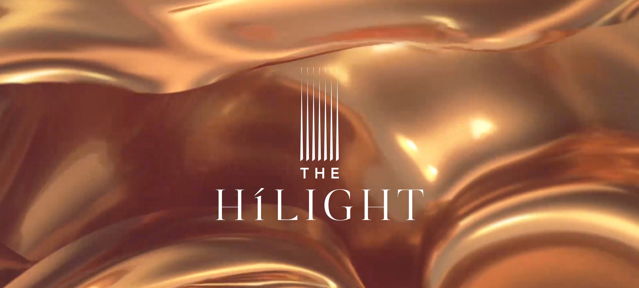
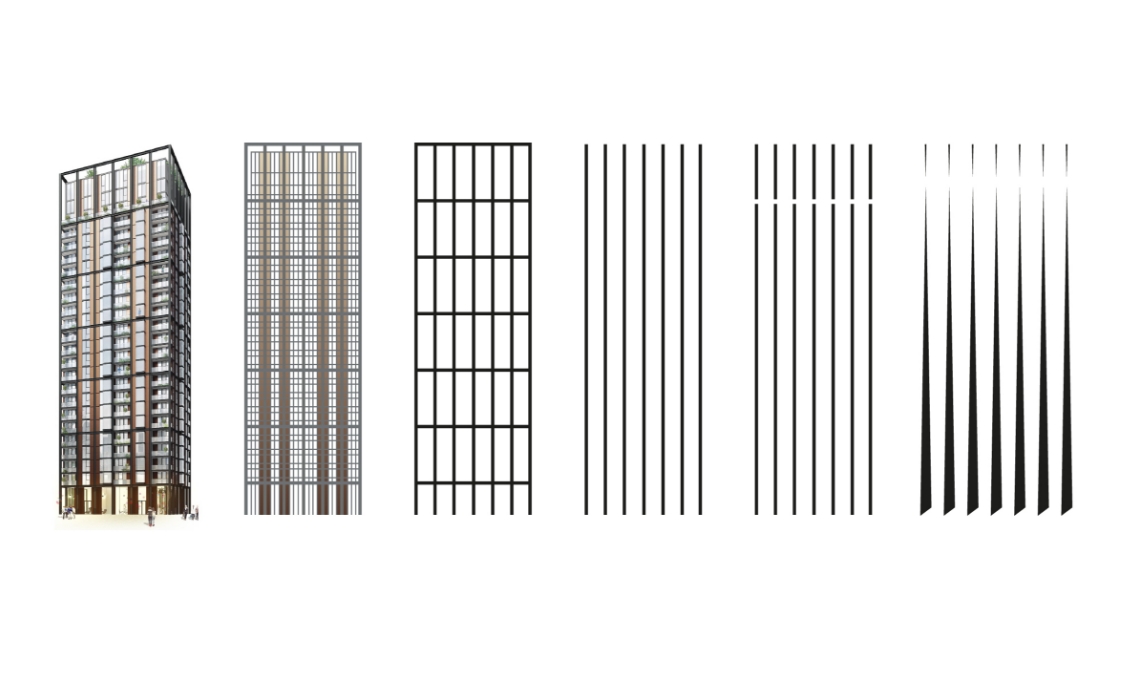
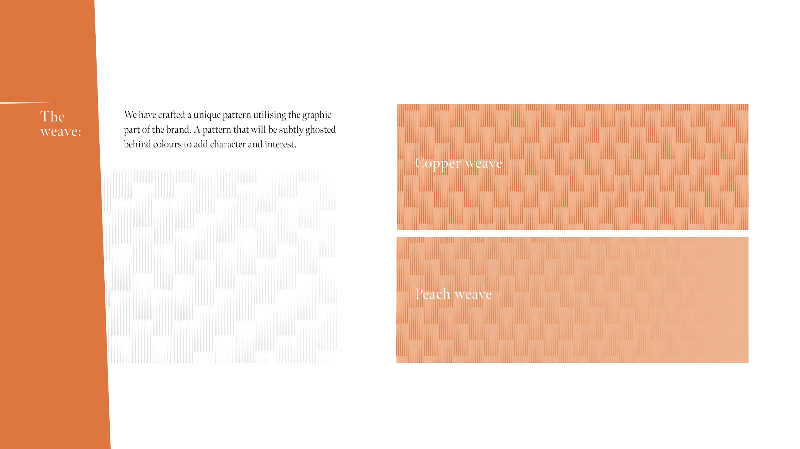
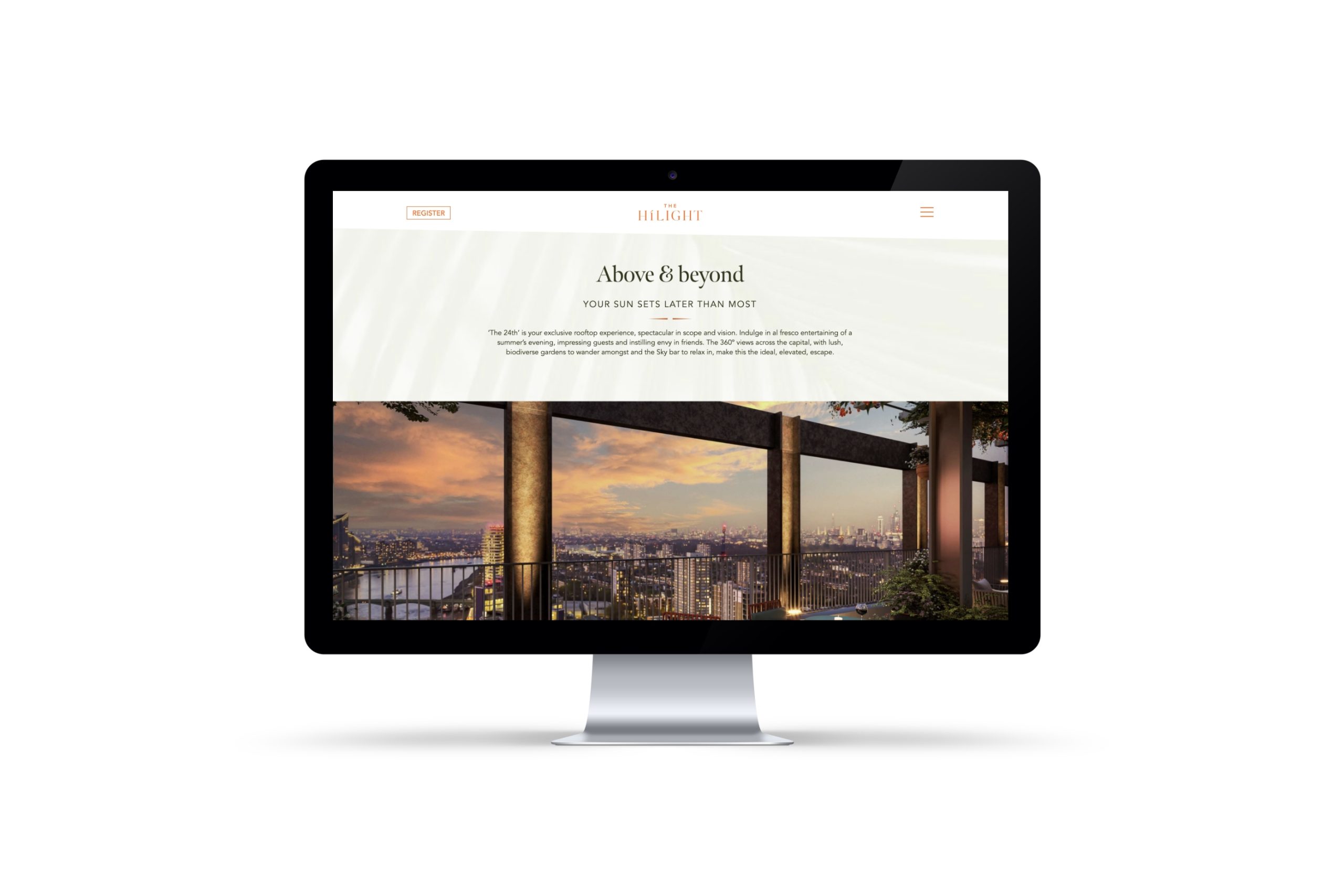
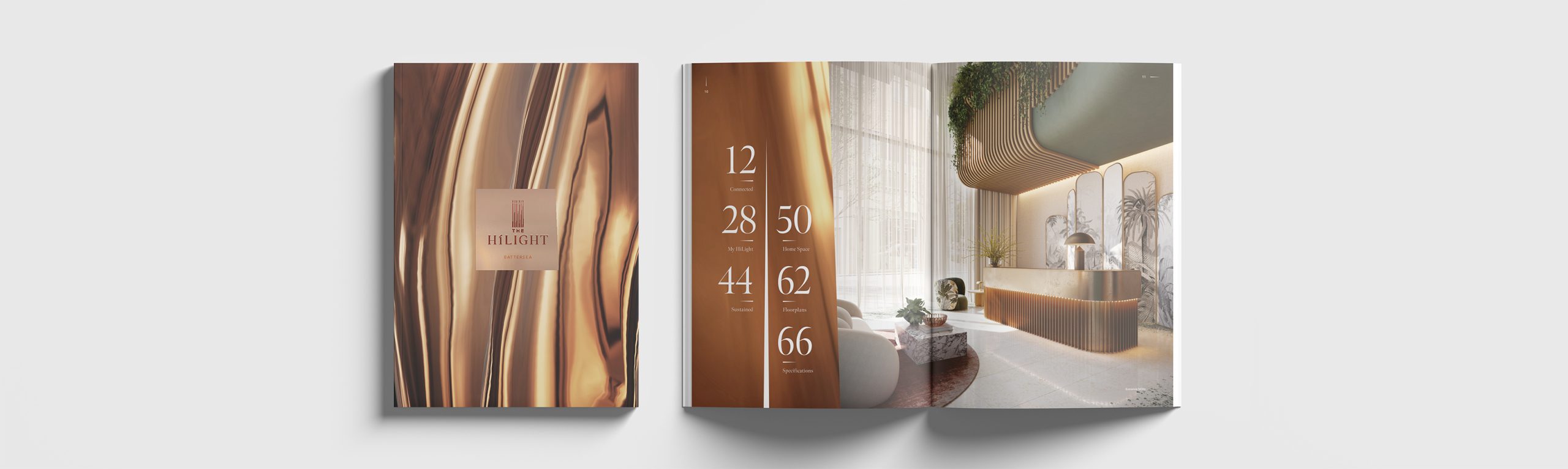
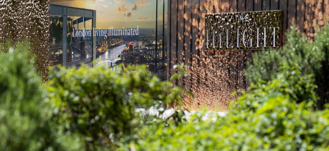
First step, name. With a subtle nod to its candle-making heritage and the bold promise of a vista-rich London life we eventually agreed upon ‘The HiLight’. The logo is a stylised crown tapering off to refined points in anticipation of the exposed metalwork that is to flow up the building. The rippling copper backdrop hints at the Thames-side location and the luxurious touches throughout the building, including a Skybar, private cinema, wellness studio and exclusive Club room. This mark succeeds in being aspirational and, vitally, recognisable; prospective buyers are assailed with multiple developers’ and estate agents’ emails, brochures, ads and cold calls for months at a time when they are in the house hunting bell-jar.
At every turn, the HiLight branding reinforces the message of an elevated lifestyle and penthouse view over the city.
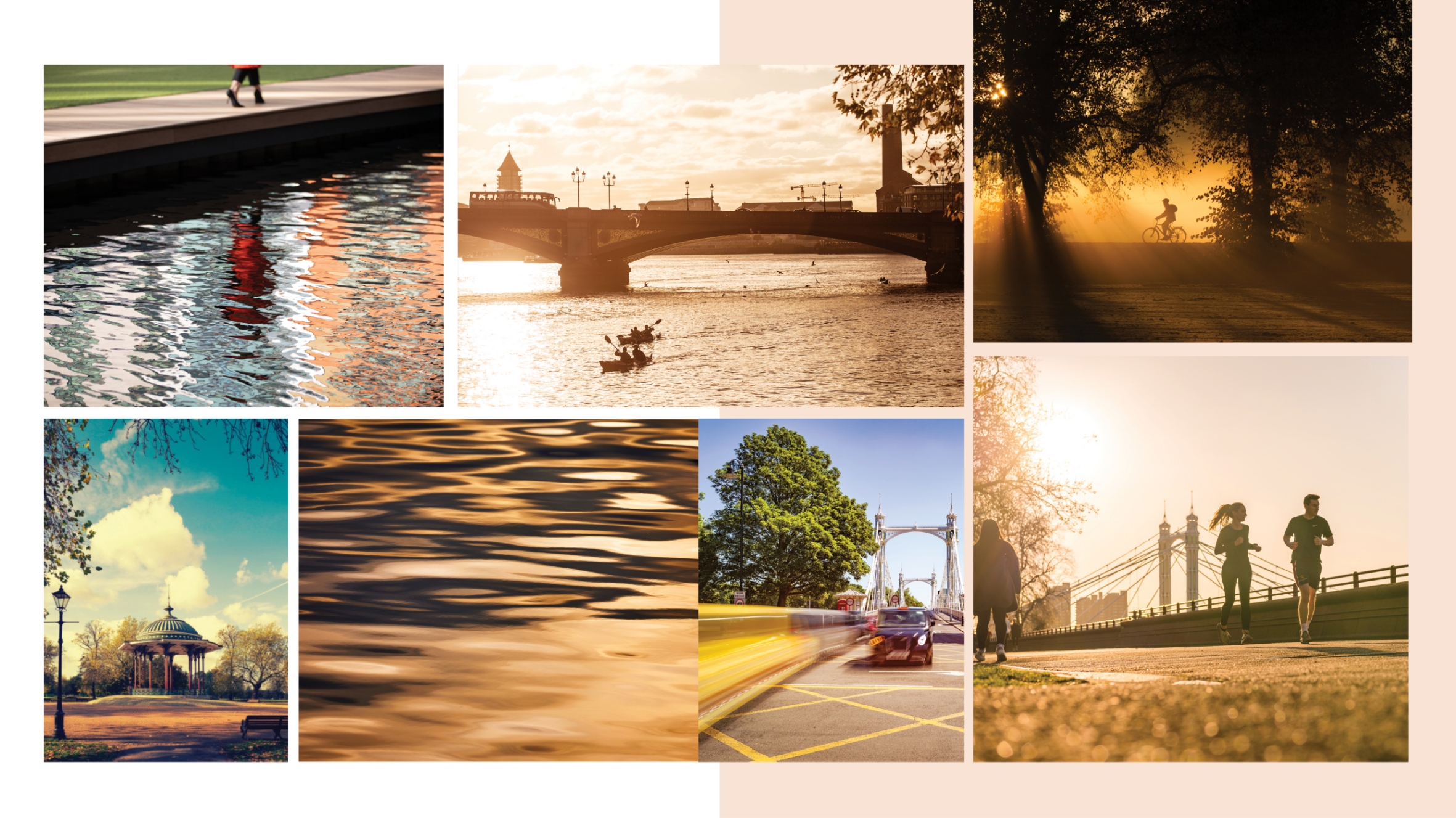
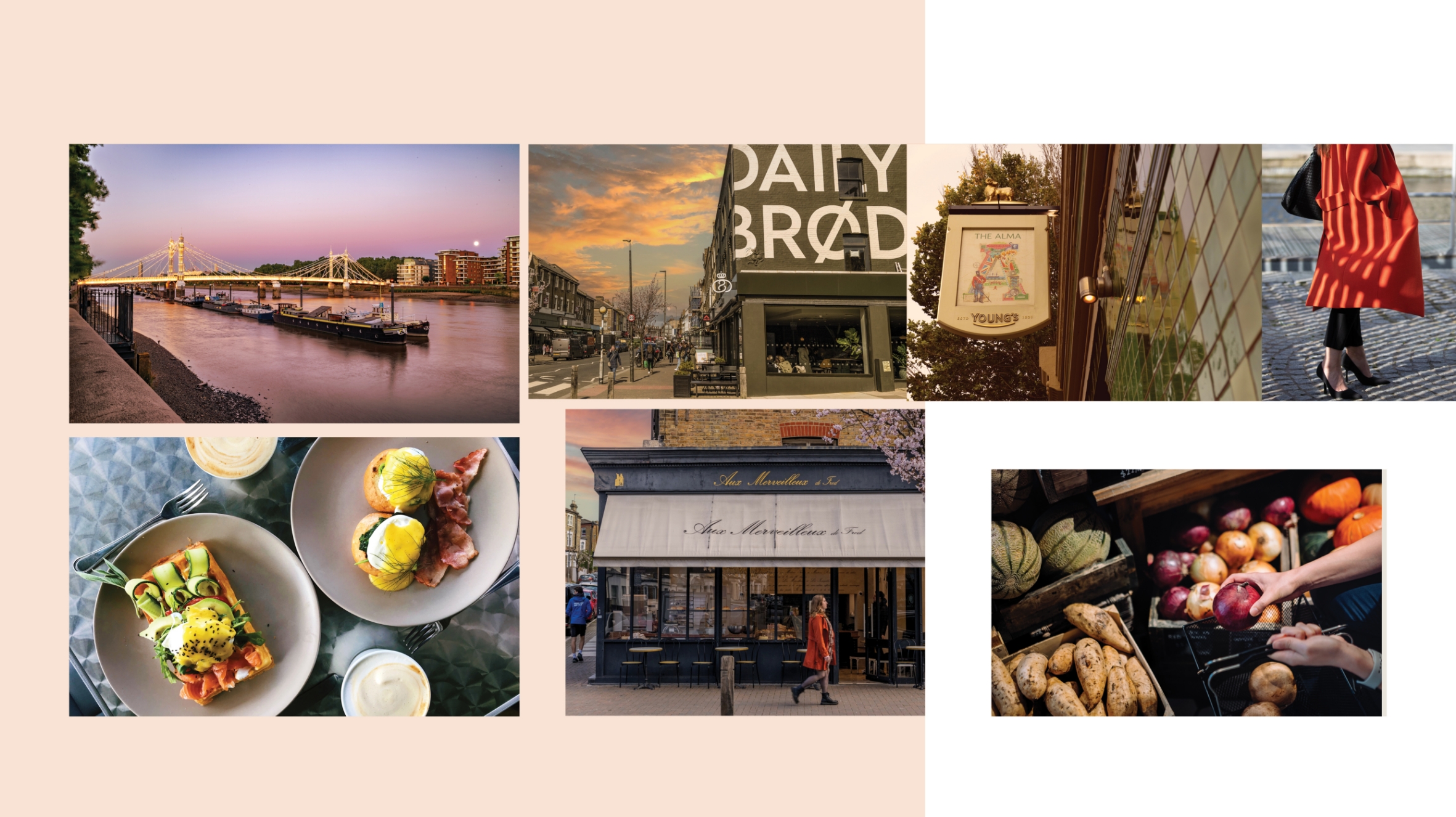
Throughout the customers’ journey they are assailed by our elevated lifestyle message. A clever mix of CGIs and a photoshoot of the surrounding neighbourhoods infused with golden-hour lighting provided a sense of halcyon days being whiled away in luxurious surroundings. The variety of formats offered multiple opportunities to impress: building site hoarding, marketing suite, website, digital ads, social media, brochure, leaflet, e-comms and events. While specifics such as prices and dimensions are introduced as the prospective buyer progresses, we have fought hard to retain an unwavering composed elegance to everything they see. If we could dress the cranes, we would.
The importance of details and consistency is obviously paramount as it is all the prospective buyer has to base their opinion on during the building stage. If the copper of the website differs from the brochure, it doesn’t bode well for the wall colours. Thus, the client was incredibly detail-orientated and demanded the best from all our teams thorough the year-long (and counting) project.


THE IMPACT
The results are beautifully rendered expressions of a luxury brand promising excellence at every turn. There was no compromise, if it couldn’t be achieve perfectly, it wasn’t done. The prospective buyer is treated to a VIP tour of their ideal future lifestyle. The client was provided with a complete marketing package ready to roll out far in advance of breaking ground.